Composició
Compose està construït al voltant de funcions componibles.
Introducció
Compose utilitza un model d’interfície d’usuari (UI) declaratiu que utilitza funcions que es componen d’altres funcions que prenen dades i emeten elements d’UI.
Aquestes funcions et permeten definir la UI de la teva aplicació mitjançant codi, descrivint quin aspecte hauria de tenir i proporcionant les dependències respecte a les dades, en lloc d’haver de centrar-te en la construcció de la UI (inicialitzant un element, afegint aquest a un element superior, etc.).
Entorn de treball
Crea un projecte “JVM GUI Application (Compose Multiplatform) amb Idea.
Si obres el fitxer module.yaml pots veure que el mòdul està configurat per Compose.
Les dependències $compose.* es declaren amb una sintaxi especial de referència al catàleg de biblioteques de l’eina Compose.
product: jvm/app

dependencies:
  - $compose.desktop.currentOs

settings:
compose: enabledCatàlegs de biblioteques
Un catàleg de biblioteques associa claus a coordenades de biblioteques (inclosa la versió) i permet afegir les mateixes biblioteques com a dependències a múltiples mòduls sense haver de repetir les coordenades ni les versions de les biblioteques.
Els catàlegs de la cadena d’eines es defineixen implícitament i contenen biblioteques predefinides relacionades amb la cadena d’eines corresponent. El nom d’un catàleg d’aquest tipus correspon al nom de la cadena d’eines corresponent a la secció de configuració.
Per exemple, les dependències dels frameworks de Compose Multiplatform són accessibles mitjançant el catàleg $compose: Referència DSL - Compose
Totes les dependències d’aquests catàlegs solen tenir la mateixa versió, que és la versió de la cadena d’eines.
Per utilitzar dependències dels catàlegs, fes servir la sintaxi $<catalog-name>.<key> en lloc de les coordenades.
dependencies:
  - org.jetbrains.kotlinx:kotlinx-datetime:0.6.2
  # Compose dependencies
  - $compose.foundation
  - $compose.material3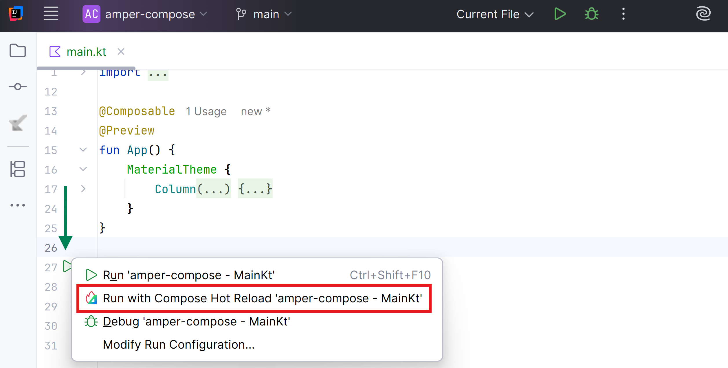
- $compose.desktop.currentOsHot Reload
Amper és compatible amb Hot Reload, que permet veure canvis de la UI en temps real sense reiniciar l’aplicació.
Utilitza l’opció CLI --compose-hot-reload-mode quan executes qualsevol mòdul Compose amb almenys la plataforma JVM.
.\amper run --compose-hot-reload-modeIntegració amb l’IDE
Quan executes la teva aplicació des de l’IDE, pots obtenir recompilació i recàrrega automàtica basada en canvis del sistema de fitxers, utilitzant el plugin Amper per a IntelliJ.
Per configurar-ho, no has de fer res, el plugin detecta automàticament la presència de Compose Hot Reload i activa la funcionalitat.
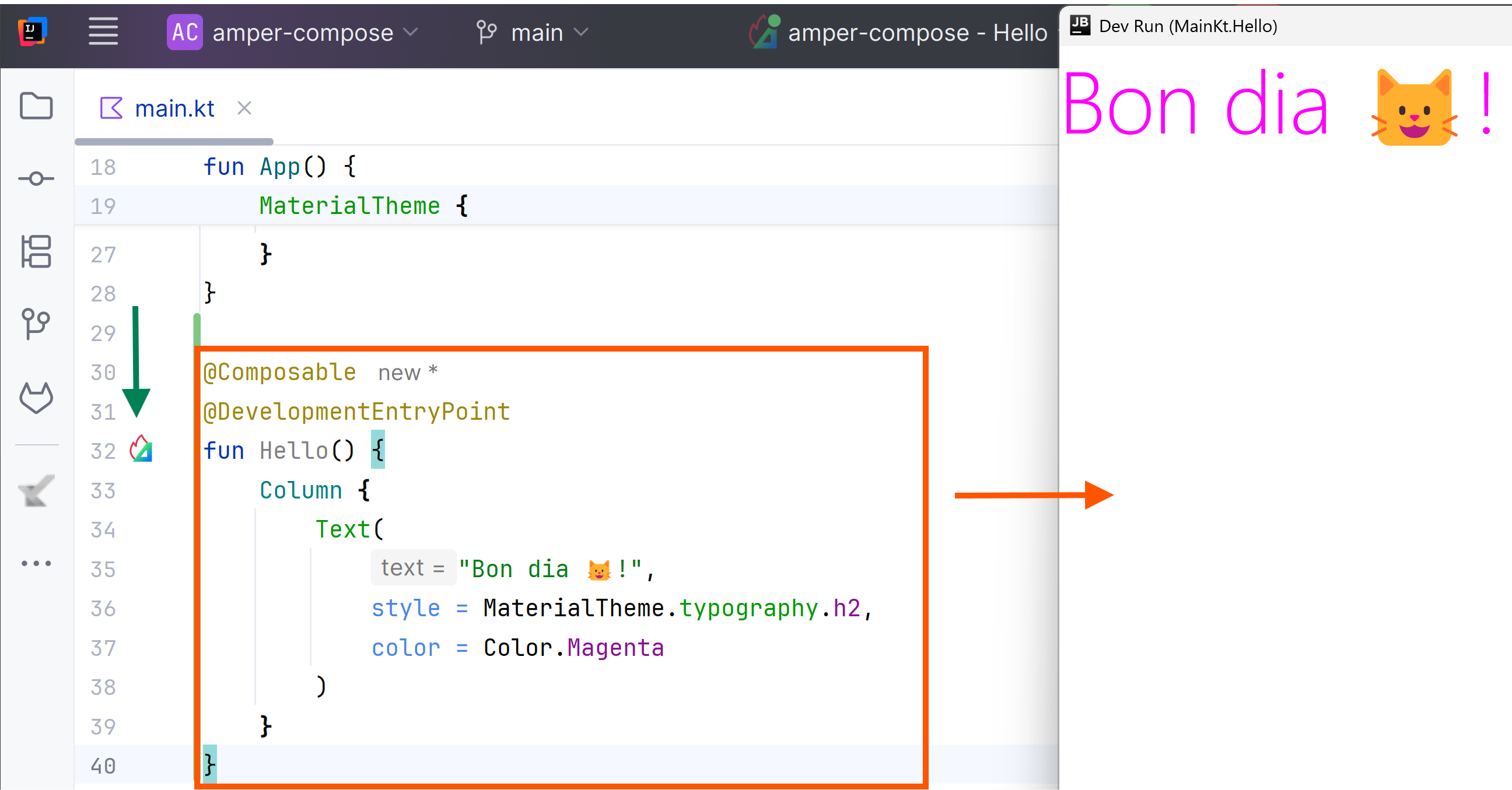
DevelopmentEntryPoint
També és possible executar componibles específics com a mode Compose Hot Reload.
Per fer-ho, has de posar l’anotació @DevelopmentEntryPoint a la funció composable sense paràmetres.
Apareixerà una icona clicable al marge esquerre del composable:
Limitacions actuals
- Has d’assegurar-te que jvm és una de les plataformes del mòdul.
- Amper no observa el sistema de fitxers, per tant, les recàrregues automàtiques només estan disponibles quan s’utilitza l’IDE.
Pendent
Funcions componibles
Les funcions componibles són el bloc de construcció bàsic de Compose.
Una funció composable és una funció que emet Unit i que descriu alguna part de la teva interfície d’usuari. La funció pren algunes dades d’entrada i genera el que es mostra a la pantalla.
Per a més informació sobre les componibles, consulta la documentació del model mental de Compose.
Per crear una funció componible només has d’afegir l’anotació @Composable al nom de la funció:
@Composable
fun Greeting(name: String) {
    Text("Hello $name")
}
Algunes coses destacables sobre aquesta funció:
-
La funció està anotada amb l’anotació
@Composable. Totes les funcions componibles han de tenir aquesta anotació perquè el compilador Compose sàpiga que aquesta funció està destinada a convertir dades en UI. -
La funció pren dades. Les funcions Composable poden acceptar paràmetres perquè la funció descrigui els components de la UI en funció d’aquests paràmetres.
-
La funció mostra text a la UI. Ho fa cridant a la funció componible
Text()creant d’aquesta manera una jerarquia d’UI cridant a altres funcions componibles. -
La funció no retorna res. Les funcions de composició que emeten UI no necessiten retornar res perquè només descriuen una part de la UI, en cap cas construeixen widgets d’UI.
-
Aquesta funció és ràpida, idempotent i lliure d’efectes secundaris. La funció es comporta de la mateixa manera quan se la crida diverses vegades amb el mateix argument i no utilitza altres valors com variables globals o crides a
random(). La funció descriu la UI sense cap efecte secundari, com modificar propietats o variables globals.
En general, totes les funcions componibles han d’escriure’s amb aquestes propietats, per les raons que s’expliquen a Recomposició.
Afegeix un element Text
Modifica el fitxer main.kt:
@Composable
@Preview
fun App() {
    MaterialTheme {
        Text("Hello World!")
    }
}
App és una funció componible que ara utilitza la funció componible Text que mostra el text “Hello World!”:
%3C/tspan%3E%3C/text%3E%3Cg%20transform=%22translate(90.81%2080.31)%20rotate(90.00)%22%3E%3Cpolygon%20points=%220,0%20-10.40,6.24%20-10.40,-6.24%22%20fill=%22%2364748B%22%20stroke=%22%2364748B%22%20stroke-width=%222%22%20stroke-linejoin=%22round%22%20stroke-linecap=%22round%22/%3E%3C/g%3E%3C/svg%3E)
%3C/tspan%3E%3C/text%3E%3Cg%20transform=%22translate(90.81%2080.31)%20rotate(90.00)%22%3E%3Cpolygon%20points=%220,0%20-10.40,6.24%20-10.40,-6.24%22%20fill=%22%2394a3b8%22%20stroke=%22%2394a3b8%22%20stroke-width=%222%22%20stroke-linejoin=%22round%22%20stroke-linecap=%22round%22/%3E%3C/g%3E%3C/svg%3E)
Defineix una funció componible
A continuació crearàs una funció componible amb l’anotació @Composable.
Defineix una funció MessageCard a la qual se li passa un nom que utilitzes per configurar un element de text.
@Composable
fun MessageCard(name: String) {
    Text(text = "Hello $name")
}Obtén una vista prèvia de la funció
L’anotació @Preview et permet obtenir una vista prèvia d’una funció componible amb els paràmetres que tu vulguis sense haver de modificar el codi principal de l’aplicació.
L’anotació s’ha d’utilitzar en una funció componible que no accepti paràmetres. Per aquest motiu, no pots obtenir una vista prèvia de la funció MessageCard directament.
En el seu lloc, crea una segona funció anomenada MessageCardPreview, que cridi MessageCard amb un paràmetre apropiat.
@Preview
@Composable
fun MessageCardPreview() {
    MessageCard("Hello, David!")
}Layouts
Els elements de la interfície d’usuari són jeràrquics i estan continguts en altres elements. A Compose, es crea una jerarquia de la interfície d’usuari cridant a funcions componibles des d’altres funcions componibles.
Afegir diversos textos
Fins ara has creat la teva primera funció componible i una vista prèvia! Per descobrir més funcions de Compose, crearàs una pantalla de missatgeria simple que contingui una llista de missatges que es pot ampliar amb algunes animacions.
Comença per enriquir el missatge componible mostrant el nom de l’autor i el contingut del missatge. Primer has de canviar el paràmetre componible perquè accepti un objecte Message en lloc d’una String i afegir un altre Text componible dins del componible MessageCard. Assegura’t d’actualitzar també la vista prèvia.
// ...
@Composable
fun App() {
MaterialTheme {
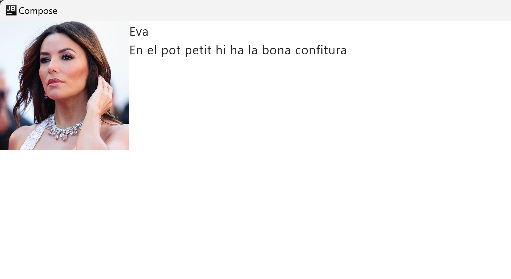
MessageCard(Message("Eva", "En el pot petit hi ha la bona confitura"))
}
}
data class Message(val author: String, val body: String)
@Composable
fun MessageCard(msg: Message) {
Text(text = msg.author)
Text(text = msg.body)
}Aquest codi crea dos elements de text dins de la vista de contingut. No obstant això, atès que no has proporcionat cap informació sobre com organitzar-los, els elements de text es dibuixen un sobre l’altre, el que fa que el text sigui il·legible.
Utilitzant una columna
La funció Column permet organitzar elements verticalment.
Afegeix una Column a la funció MessageCard. Pots utilitzar Row per organitzar elements horitzontalment i Box per apilar elements.
// ...

@Composable
fun MessageCard(msg: Message) {
    Column {
        Text(text = msg.author)
        Text(text = msg.body)
    }
}Afegeix una imatge
A continuació afegeix una foto de perfil del remitent a MessageCard.
Has d’afegir les imatges al directori composeResources/drawable.
Has d’executar el projecte per generar la classe Res.
Afegeix un componible Row per tenir un disseny ben estructurat i un componible Image dins d’ell.
// ...
import org.jetbrains.compose.resources.painterResource

// Resources
import compose_composition.generated.resources.Res
import compose_composition.generated.resources.eva

@Composable
fun MessageCard(msg: Message) {
    Row {
        Image(
            painter = painterResource(Res.drawable.eva),
            contentDescription = "Contact profile picture"

        )
        Column {
            Text(text = msg.author)
            Text(text = msg.body)
        }
    }
}Configura el layout
El disseny del teu missatge té l’estructura correcta, però els seus elements no estan ben espaiats i la imatge és massa gran.
Per decorar o configurar un element componible, Compose utilitza modifiers. Aquests permeten canviar la mida, el disseny i l’aparença de l’element componible o afegir interaccions d’alt nivell, com fer que es pugui fer clic en un element. Pots encadenar-los per crear elements componibles més complets. Utilitzaràs alguns d’ells per millorar el disseny.
// ...
import androidx.compose.foundation.layout.Spacer
import androidx.compose.foundation.layout.height
import androidx.compose.foundation.layout.padding
import androidx.compose.foundation.layout.size
import androidx.compose.foundation.layout.width
import androidx.compose.foundation.shape.CircleShape
import androidx.compose.ui.Modifier
import androidx.compose.ui.draw.clip
import androidx.compose.ui.unit.dp

@Composable
fun MessageCard(msg: Message) {
    // Add padding around our message
    Row(modifier = Modifier.padding(all = 16.dp)) {
        Image(
            painter = painterResource(R.drawable.eva),
            contentDescription = "Contact profile picture",
            modifier = Modifier
                // Set image size to 80 dp
                .size(80.dp)
                // Clip image to be shaped as a circle
                .clip(CircleShape)
        )

        // Add a horizontal space between the image and the column
        Spacer(modifier = Modifier.width(16.dp))

        Column {
            Text(text = msg.author)
            // Add a vertical space between the author and message texts
            Spacer(modifier = Modifier.height(8.dp))
            Text(text = msg.body)
        }
    }
}Material Design
Compose està dissenyat per admetre els principis de Material Design. Molts dels seus elements d’interfície d’usuari implementen Material Design de manera predeterminada. En aquesta lliçó, dissenyaràs la teva aplicació amb widgets de Material Design.
Compose está diseñado para admitir los principios de Material Design. Muchos de sus elementos de interfaz de usuario implementan Material Design de manera predeterminada. En esta lección, diseñarás tu aplicación con widgets de Material Design.
TODO Revisar si cal modificar la configuració d’Amper.
Compose ofereix una implementació de Material Design 3 i els seus elements d’interfície d’usuari llestos per utilitzar. Milloraràs l’aparença de componible MessageCard mitjançant l’estil de Material Design.
Per començar, embolica la funció MessageCard amb el tema Material creat en el teu projecte, MaterialTheme, així com un Surface.
// ...

@Composable
fun App() {
    MaterialTheme {
        Surface(modifier = Modifier.fillMaxSize()) {
            MessageCard(Message("Eva", "En el pot petit hi ha la bona confitura"))
        }
    }
}
Material Design es basa en tres pilars: Color, Typography, i Shape. Els aniràs afegint un per un.
Color
Utilitza MaterialTheme.colors per estilitzar amb colors del tema embolcallat. Pots utilitzar aquests valors del tema en qualsevol lloc on es necessiti un color. Aquest exemple utilitza colors de temes dinàmics (definits per les preferències del dispositiu).
Pots establir dynamicColor a false al fitxer MaterialTheme.kt per canviar això. TODO on?
Estilitza el títol i afegeix una vora a la imatge.
// ...
import androidx.compose.foundation.border
import androidx.compose.material3.MaterialTheme

@Composable
fun MessageCard(msg: Message) {
    // Add padding around our message
    Row(modifier = Modifier.padding(all = 16.dp)) {
        Image(
            painter = painterResource(Res.drawable.eva),
            contentDescription = "Contact profile picture",
            modifier = Modifier
                // Set image size to 80 dp
                .size(80.dp)
                // Clip image to be shaped as a circle
                .clip(CircleShape).border(3.dp, color = MaterialTheme.colors.primary, CircleShape)
        )

        // Add a horizontal space between the image and the column
        Spacer(modifier = Modifier.width(16.dp))

        Column {
            Text(
                text = msg.author,
                color = MaterialTheme.colors.secondary
            )
            // Add a vertical space between the author and message texts
            Spacer(modifier = Modifier.height(8.dp))
            Text(text = msg.body)
        }
    }
}Typography
Els estils de Material Typography estan disponibles al MaterialTheme, només cal afegir-los als composables Text.
// ...

@Composable
fun MessageCard(msg: Message) {
   Row(modifier = Modifier.padding(all = 16.dp)) {
       Image(
           painter = painterResource(R.drawable.profile_picture),
           contentDescription = null,
           modifier = Modifier
               .size(80.dp)
               .clip(CircleShape)
               .border(3.dp, MaterialTheme.colors.primary, CircleShape)
       )

       Spacer(modifier = Modifier.width(16.dp))

       Column {
           Text(
               text = msg.author,
               color = MaterialTheme.colors.secondary,
               style = MaterialTheme.typography.titleMedium
           )

           Spacer(modifier = Modifier.height(8.dp))
           Text(
               text = msg.body,
               style = MaterialTheme.typography.bodyLarge
           )
       }
   }
}Shape
Amb Shape pots afegir els tocs finals. Primer, embolica el text del cos del missatge amb un composable Surface. Això permet personalitzar la forma i l’elevació del cos del missatge. També s’afegeix padding al missatge per a un millor disseny.
// ...
import androidx.compose.material3.Surface

@Composable
fun MessageCard(msg: Message) {
    Row(modifier = Modifier.padding(all = 16.dp)) {
        Image(
            painter = painterResource(R.drawable.coyote),
            contentDescription = "Contact profile picture",
            modifier = Modifier
                .size(80.dp)
                .clip(CircleShape)
                .border(
                    3.dp, MaterialTheme.colors.primary,
                    CircleShape
                )
        )
        Spacer(modifier = Modifier.width(16.dp))
        Column {
            Text(
                text = msg.author, color = MaterialTheme.colors.secondary,
                style = MaterialTheme.typography.titleMedium
            )
            Spacer(modifier = Modifier.height(8.dp))
            Surface(shape = MaterialTheme.shapes.large, shadowElevation = 2.dp) {
                Text(
                    text = msg.body,
                    modifier = Modifier.padding(all = 4.dp),
                    style = MaterialTheme.typography.bodyLarge
                )
            }
        }
    }
}Llistes i animacions
Les llistes i animacions són presents a tot arreu en les aplicacions. En aquesta lliçó, aprendràs com Compose fa que sigui fàcil crear llistes i divertit afegir animacions.
Crear una llista de missatges
Un xat amb un missatge sembla una mica solitari, així que canviarem la conversa per tenir més d’un missatge..
val messages = listOf(
    Message(
        "Josep Pla",
        "Antigament, el viatjar era un privilegi de gran senyor. Generalment, era la coronació normal dels estudis d'un home. Ara el viatjar s'ha generalitzat i democratitzat considerablement. Viatja molta gent"
    ),
    Message(
        "Josep Pla",
        "Però, potser, les persones que viatgen per arrodonir i afermar la seva visió del món i dels homes són més rares avui que fa cent anys. "
    ),
    Message(
        "Josep Pla",
        "En el nostre país hi ha tres pretextos essencials per a passar la frontera: la peregrinació a Lourdes, la lluna de mel i els negocis. Hom no pot tenir idea de la quantitat de gent del nostre país que ha estat a Lourdes. És incomptable. "
    ),
    Message(
        "Josep Pla",
        "Fa trenta anys, les persones riques de Catalunya feien el viatge de noces a Madrid. Avui van a París o a Niça i de vegades a Itàlia. La lluna de mel, però, és un mal temps per veure res i per formar-se. No es poden pas fer dues coses importants a la vegada. El pitjor temps, potser, per a viatjar, de la vida, és la temporada de la lluna de mel."
    ),
)
Necessitaràs crear una funció Conversation que mostrarà múltiples missatges. Per a aquest cas d’ús, utilitza els LazyColumn i LazyRow de Compose. Aquests composables renditzen només els elements que són visibles a la pantalla, per la qual cosa estan dissenyats per ser molt eficients per a llistes llargues.
En aquest fragment de codi, pots veure que LazyColumn té un fill items. Pren una List com a paràmetre i la seva lambda rep un paràmetre que hem anomenat message (podríem haver-lo anomenat com volguéssim) que és una instància de Message. En resum, aquesta lambda es crida per a cada element de la List proporcionada.
// ...
import androidx.compose.foundation.lazy.LazyColumn
import androidx.compose.foundation.lazy.items

@Composable
fun App() {
    MaterialTheme {
        Surface(modifier = Modifier.fillMaxSize()) {
            Conversation(messages)
        }
    }
}

@Composable
fun Conversation(messages: List<Message>) {
    LazyColumn {
        items(messages) { message -> MessageCard(message) }
    }
}Animar missatges mentre s’expandeixen
La conversa s’està tornant més interessant. És hora de jugar amb les animacions! Afegiràs la capacitat d’expandir un missatge per mostrar-ne un de més llarg, animant tant la mida del contingut com el color de fons. Per emmagatzemar aquest estat d’UI local, has de mantenir un registre de si un missatge s’ha expandit o no. Per mantenir un registre d’aquest canvi d’estat, has d’utilitzar les funcions remember i mutableStateOf.
Les funcions composables poden emmagatzemar estat local en memòria utilitzant remember, i fer un seguiment dels canvis al valor passat a mutableStateOf. Els composables (i els seus fills) que utilitzen aquest estat es tornaran a dibuixar automàticament quan el valor s’actualitzi. Això s’anomena recomposició.
Utilitzant les APIs d’estat de Compose com remember i mutableStateOf, qualsevol canvi en l’estat actualitza automàticament la UI.
// ...
import androidx.compose.foundation.clickable
import androidx.compose.runtime.getValue
import androidx.compose.runtime.mutableStateOf
import androidx.compose.runtime.remember
import androidx.compose.runtime.setValue

@Composable
fun MessageCard(msg: Message) {

        // ...

        // We keep track if the message is expanded or not in this
        // variable
        var isExpanded by remember { mutableStateOf(false) }

        Column(modifier = Modifier.clickable{isExpanded = !isExpanded}) {

            Text(
                text = msg.author,
                color = MaterialTheme.colors.secondary,
                style = MaterialTheme.typography.subtitle2
            )
            // Add a vertical space between the author and message texts
            Spacer(modifier = Modifier.height(8.dp))
            Surface(shape = MaterialTheme.shapes.large, elevation = 2.dp) {
                Text(
                    text = msg.body,
                    modifier = Modifier.padding(all = 4.dp),

                    // If the message is expanded, we display all its content
                    // otherwise we only display the first line
                    maxLines = if (isExpanded) Int.MAX_VALUE else 1,

                    style = MaterialTheme.typography.body1
                )
            }
        }
    }
}
Ara pots canviar el fons del contingut del missatge basat en isExpanded quan fem clic en un missatge. Utilitzaràs el modificador clickable per gestionar els esdeveniments de clic en el composable.
En lloc de simplement alternar el color de fons del Surface, animaràs el color de fons modificant gradualment el seu valor de MaterialTheme.colors.surface a MaterialTheme.colors.primary i viceversa.
Per fer-ho, utilitzaràs la funció animateColorAsState.
Finalment, utilitzaràs el modificador animateContentSize per animar la mida del contenidor del missatge suaument:
// ...
import androidx.compose.animation.animateColorAsState
import androidx.compose.animation.animateContentSize

@Composable
fun MessageCard(msg: Message) {
    // Add padding around our message
    Row(modifier = Modifier.padding(all = 16.dp)) {
        Image(
            painter = painterResource(Res.drawable.josep),
            contentDescription = "Contact profile picture",
            modifier = Modifier
                // Set image size to 80 dp
                .size(80.dp)
                // Clip image to be shaped as a circle
                .clip(CircleShape).border(3.dp, color = MaterialTheme.colors.primary, CircleShape)
        )

        // Add a horizontal space between the image and the column
        Spacer(modifier = Modifier.width(16.dp))

        // We keep track if the message is expanded or not in this
        // variable
        var isExpanded by remember { mutableStateOf(false) }

        // surfaceColor will be updated gradually from one color to the other
        val surfaceColor by animateColorAsState(
            if (isExpanded) MaterialTheme.colors.primary else MaterialTheme.colors.surface
        )

        Column(modifier = Modifier.clickable { isExpanded = !isExpanded }) {
            Text(
                text = msg.author,
                color = MaterialTheme.colors.secondary,
                style = MaterialTheme.typography.subtitle2
            )
            // Add a vertical space between the author and message texts
            Spacer(modifier = Modifier.height(8.dp))
            Surface(
                shape = MaterialTheme.shapes.large,
                elevation = 2.dp,
                // surfaceColor color will be changing gradually from primary to surface
                color = surfaceColor,
                // animateContentSize will change the Surface size gradually
                modifier = Modifier.animateContentSize().padding(2.dp)
            ) {
                Text(
                    text = msg.body,
                    modifier = Modifier.padding(all = 4.dp),
                    // If the message is expanded, we display all its content
                    // otherwise we only display the first line
                    maxLines = if (isExpanded) Int.MAX_VALUE else 1,
                    style = MaterialTheme.typography.body1
                )
            }
        }
    }
}Layout
Compose transforma l’estat en elements d’interfície d’usuari, mitjançant:
- Composició d’elements
- Disseny d’elements
- Dibuix d’elements

Una funció composable pot emetre diversos elements d’interfície d’usuari. No obstant això, si no proporciones orientació sobre com s’han de disposar, Compose pot organitzar els elements d’una manera que no t’agradi.
Per exemple, aquest codi genera dos elements de text:
@Composable
fun ArtistCard() {
    Text("Alfred Sisley")
    Text("3 minutes ago")
}
Sense orientació sobre com vols que estiguin disposats, Compose apila els elements de text un sobre l’altre, fent-los il·legibles:

Components de disseny estàndard
En molts casos, pots utilitzar simplement els elements de disseny estàndard de Compose.
Utilitza Column per col·locar elements verticalment a la pantalla.
@Composable
fun ArtistCardColumn() {
    Column {
        Text("Alfred Sisley")
        Text("3 minutes ago")
    }
}
De manera similar, utilitza Row per col·locar elements horitzontalment a la pantalla.
Tant Column com Row permeten configurar l’alineació dels elements que contenen.
@Composable
fun ArtistCardRow(artist: Artist) {
    Row(verticalAlignment = Alignment.CenterVertically) {
        Image(bitmap = artist.image, contentDescription = "Artist image")
        Column {
            Text(artist.name)
            Text(artist.lastSeenOnline)
        }
    }
}
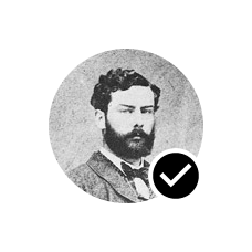
Utilitza Box per col·locar elements un sobre l’altre. Box també permet configurar l’alineació específica dels elements que conté.
@Composable
fun ArtistAvatar(artist: Artist) {
    Box {
        Image(bitmap = artist.image, contentDescription = "Artist image")
        Icon(Icons.Filled.Check, contentDescription = "Check mark")
    }
}
Sovint aquests blocs de construcció són tot el que necessites. Pots escriure la teva pròpia funció composable per combinar aquests dissenys en un disseny més elaborat que s’adapti a la teva aplicació.

Compose gestiona els dissenys imbricats de manera eficient, convertint-los en una excel·lent manera de dissenyar una interfície d’usuari complicada. Això és una millora respecte a les Vistes d’Android, on cal evitar dissenys imbricats per raons de rendiment.
Per establir la posició dels fills dins d’una Row, defineix els arguments horizontalArrangement i verticalAlignment. Per a una Column, defineix els arguments verticalArrangement i horizontalAlignment:
@Composable
fun ArtistCardArrangement(artist: Artist) {
    Row(
        verticalAlignment = Alignment.CenterVertically,
        horizontalArrangement = Arrangement.End
    ) {
        Image(bitmap = artist.image, contentDescription = "Artist image")
        Column { /*...*/ }
    }
}
El model de disseny
En el model de disseny, l’arbre d’interfície d’usuari es disposa en una sola passada. Primer es demana a cada node que es mesuri a si mateix, després que mesuri qualsevol fill de manera recursiva, passant les restriccions de mida cap avall de l’arbre als fills. Després, els nodes fulla s’ajusten de mida i es col·loquen, amb les mides resoltes i les instruccions de col·locació passades de tornada cap amunt de l’arbre.
Breument, els pares es mesuren abans que els seus fills, però s’ajusten de mida i es col·loquen després dels seus fills.
Considera la següent funció SearchResult.
@Composable
fun SearchResult() {
    Row {
        Image(
            // ...
        )
        Column {
            Text(
                // ...
            )
            Text(
                // ...
            )
        }
    }
}
Aquesta funció genera el següent arbre d’interfície d’usuari.
SearchResult
  Row
    Image
    Column
      Text
      Text
En l’exemple SearchResult, el disseny de l’arbre d’interfície d’usuari segueix aquest ordre:
- Es demana al node arrel
Rowque es mesuri. - El node arrel
Rowdemana al seu primer fill,Image, que es mesuri. Imageés un node fulla (és a dir, no té fills), així que informa d’una mida i retorna instruccions de col·locació.- El node arrel
Rowdemana al seu segon fill,Column, que es mesuri. - El node
Columndemana al seu primer fillTextque es mesuri. - El primer node
Textés un node fulla, així que informa d’una mida i retorna instruccions de col·locació. - El node
Columndemana al seu segon fillTextque es mesuri. - El segon node
Textés un node fulla, així que informa d’una mida i retorna instruccions de col·locació. - Ara que el node
Columnha mesurat, dimensionat i col·locat els seus fills, pot determinar la seva pròpia mida i col·locació. - Ara que el node arrel
Rowha mesurat, dimensionat i col·locat els seus fills, pot determinar la seva pròpia mida i col·locació.

Rendiment
Compose aconsegueix un alt rendiment mesurant els fills només una vegada. El mesurament d’una sola passada és bo per al rendiment, permetent a Compose gestionar eficientment arbres d’interfície d’usuari profunds. Si un element mesurés el seu fill dues vegades i aquest fill mesurés cada un dels seus fills dues vegades i així successivament, un sol intent de disposar tota una interfície d’usuari hauria de fer molta feina, fent difícil mantenir l’aplicació amb bon rendiment.
Si el teu disseny necessita múltiples mesuraments per algun motiu, Compose ofereix un sistema especial, mesuraments intrínsecs. Pots llegir més sobre aquesta funcionalitat a Mesuraments intrínsecs en dissenys Compose.
Atès que el mesurament i la col·locació són subfases diferents de la passada de disseny, qualsevol canvi que només afecti la col·locació dels elements, no el mesurament, es pot executar per separat.
Utilitzar modificadors en els teus dissenys
Com es discuteix a Modificadors Compose, pots utilitzar modificadors per decorar o augmentar els teus composables. Els modificadors són essencials per personalitzar el teu disseny.
Per exemple, aquí encadenem diversos modificadors per personalitzar l’ArtistCard:
@Composable
fun ArtistCardModifiers(
    artist: Artist,
    onClick: () -> Unit
) {
    val padding = 16.dp
    Column(
        Modifier
            .clickable(onClick = onClick)
            .padding(padding)
            .fillMaxWidth()
    ) {
        Row(verticalAlignment = Alignment.CenterVertically) { /*...*/ }
        Spacer(Modifier.size(padding))
        Card(
            elevation = CardDefaults.cardElevation(defaultElevation = 4.dp),
        ) { /*...*/ }
    }
}
A partir d’aquí s’ha de moure a una activitat més avançada: Compose layout basics ++